Brand Guidelines
本指南定義了 Be my Hooman 的視覺語言、設計風格與核心原則,以建立一致且溫暖的品牌體驗,不論應用於何種媒介或情境。
Be my Hooman 的核心圍繞著陪伴、連結與歸屬,重新詮釋人與動物之間的關係。透過柔和且富有情感的視覺系統,本指南建立了品牌識別的基礎規範,涵蓋標誌系統、色彩、字體、吉祥物與延伸應用。
本指南定義了 Be my Hooman 的視覺語言、設計風格與核心原則,以建立一致且溫暖的品牌體驗,不論應用於何種媒介或情境。
Be my Hooman 的核心圍繞著陪伴、連結與歸屬,重新詮釋人與動物之間的關係。透過柔和且富有情感的視覺系統,本指南建立了品牌識別的基礎規範,涵蓋標誌系統、色彩、字體、吉祥物與延伸應用。
Contents
01 Brand Introduction
02 Personality
03 Logo System
04 Color
05 Typography
01 Brand Introduction

We help animals find their hooman by turning adoption into a warm and human-centered experience.

Be my Hooman 是一個專為流浪動物認養打造的資訊整合平台,串聯政府資源與收容所,並結合 AI 技術打造更溫暖且具有互動性的認養體驗,拉近領養者與毛孩之間的距離。
我們相信,每一隻毛孩都值得被看見、被理解,最終找到真正的夥伴與歸屬。品牌以「人+動物=家」為核心概念,重新詮釋傳統認養關係,從「人選擇動物」轉變為傾聽牠們的聲音——「成為我的家人吧。」
Be my Hooman 不只是品牌名稱,更是一句來自動物視角的邀請。“Hooman” 為 “Human” 的擬人化拼法,常見於寵物視角的網路文化中,以溫柔且俏皮的語氣稱呼人類或主人。品牌以此作為命名,傳達人與動物之間平等、陪伴與情感連結的關係。
Be my Hooman is an integrated platform for pet adoption, connecting government and shelter resources with a unique AI-powered experience that shortens the distance between humans and animals.We believe every animal deserves to be seen, understood, and ultimately find their lifelong companion and home.Rooted in the idea of “Human + Animal = Home,” the platform gently reverses the roles and invites us to listen to their voice :
Be my family.

Connection
始於連結
It’s not just adoption. It’s a connection.
我們不是在選擇一隻動物,
而是在建立一段關係。
Belonging

彼此歸屬
Home is not a place. It’s where you belong.
家,不只是空間,
是一種被需要、被等待、被理解的感受。

Companionship
終於陪伴
It’s not about ownership. It’s about sharing a life.
陪伴不是擁有,
而是一起生活。
02 Personality
Be my Hooman 透過溫柔、真誠且富有親和力的語言,建立人與動物之間更靠近的情感連結。我們相信,每一次理解,都有機會改變一段生命關係。透過清晰且富有溫度的溝通方式,讓認養資訊與互動體驗變得更輕鬆、更容易接近,也讓「找到家」這件事不再只是流程,而是一段關係的開始。
品牌語氣保持親切、柔和且透明,在傳遞資訊的同時,也保留情感與陪伴感,讓每一次接觸都能感受到 Be my Hooman 所重視的溫暖與連結。
Be my Hooman brings the brand to life through a warm, sincere, and approachable voice that strengthens the emotional connection between humans and animals.
We believe every moment of understanding has the power to change a life. Through clear and thoughtful communication, we make adoption information and interactions feel more accessible, welcoming, and emotionally engaging — transforming the journey of finding a home into the beginning of a meaningful bond.
Our voice remains gentle, transparent, and friendly, balancing clarity with warmth to ensure every touchpoint reflects the companionship and connection at the heart of Be my Hooman.
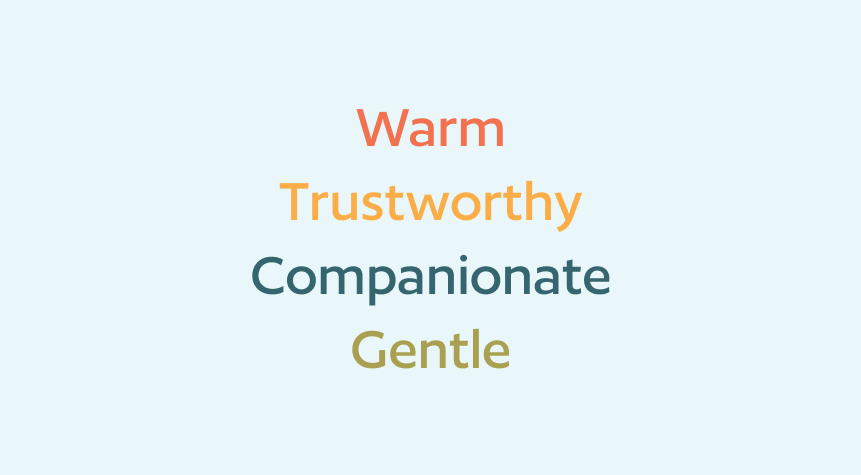
Tone & Voice
Our Vision: why we exist
To create a world where every animal is seen, understood, and given the chance to belong.
我們希望創造一個讓每一隻流浪動物都能被看見、被理解,並有機會找到屬於自己 Hooman 的世界。
Our Mission: what we do
Connect adopters with stray animals through a more compassionate and accessible adoption experience.
透過更溫柔的認養體驗,建立人與流浪動物之間的連結。
Our Promise: how we help
To make adoption feel more human, approachable, and emotionally connected — helping every interaction become the beginning of a meaningful relationship.
讓每一次領養體驗都更有溫度、更容易接近,也更重視情感連結。
03 Logo
The Redo logo is a sleek, modern arrow that curves backward, symbolizing the power to rewind, correct, and optimize financial decisions. The reversed motion represents our core mission—helping businesses go back, fix errors, and recover lost value.
Designed with clean, sharp lines, the arrow conveys precision and efficiency, while its fluid motion suggests agility and adaptability in financial correction. The color palette reinforces trust and clarity—deep blues or greens for stability, complemented by bold accents to signify action and resolution.
More than just a symbol, the Redo logo embodies our commitment to turning financial missteps into opportunities for growth—because tin business, every mistake deserves a second chance.
Be my Hooman 不只是品牌名稱,更是一句邀請。
“Hooman” 是 “Human” 的擬人化拼法,常以寵物視角稱呼人類或主人,帶有俏皮而溫柔的語氣。品牌以此為名,翻轉傳統「人選擇動物」的視角,改由動物發出邀請——「成為我的家人吧。」
整體標誌系統以柔和圓潤的曲線構成,傳達親和與情感流動。視覺不強調權威,而強調關係,象徵人與動物之間平等、靠近與陪伴的連結。
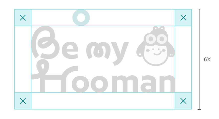
Primary Lockup 主標誌
Clearspace
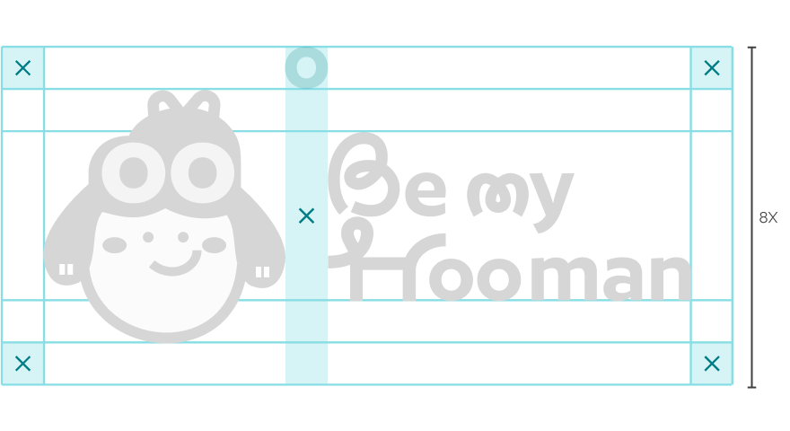
在標誌周圍留白,可以凸顯它的重要性。以 X 來定義淨空範圍,在四周至少保留 1 個 X 的空間。
The clear space is defined as X. A minimum distance of 1X must be maintained on all sides of the logo.
Usage 使用情境

官網主頁
Official website header
正式文件
Formal documents
對外識別物
Corporate materials
Secondary Lockup 次標誌
Clear Space
在標誌周圍留白,可以凸顯它的重要性。以 X 來定義淨空範圍,在四周至少保留 1 個 X 的空間。
The clear space is defined as X. A minimum distance of 1X must be maintained on all sides of the logo.
Usage 使用情境
社群平台
Social media
數位宣傳
Digital promotions
較活潑的應用場景
Informal applications

歡迎為延伸標誌搭配不同吉祥物造型
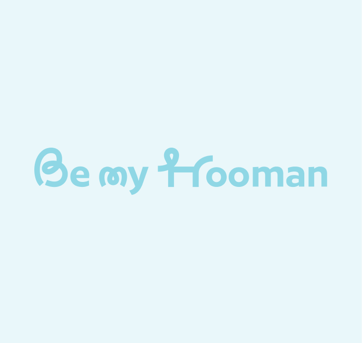
LogoType 標準字
Clear Space
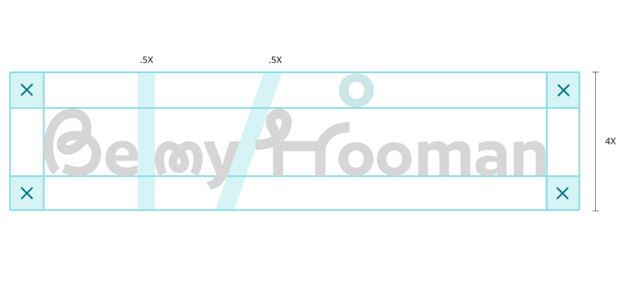
在標誌周圍留白,可以凸顯它的重要性。以 X 來定義淨空範圍,在四周至少保留 1 個 X 的空間。
The clear space is defined as X. A minimum distance of 1X must be maintained on all sides of the logo.
LogoMark 圖形標誌
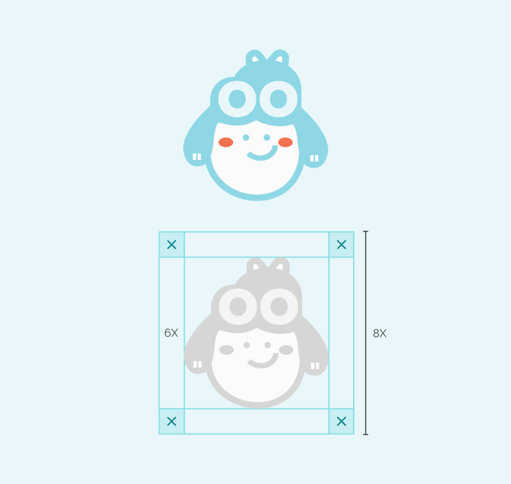
Character Mark
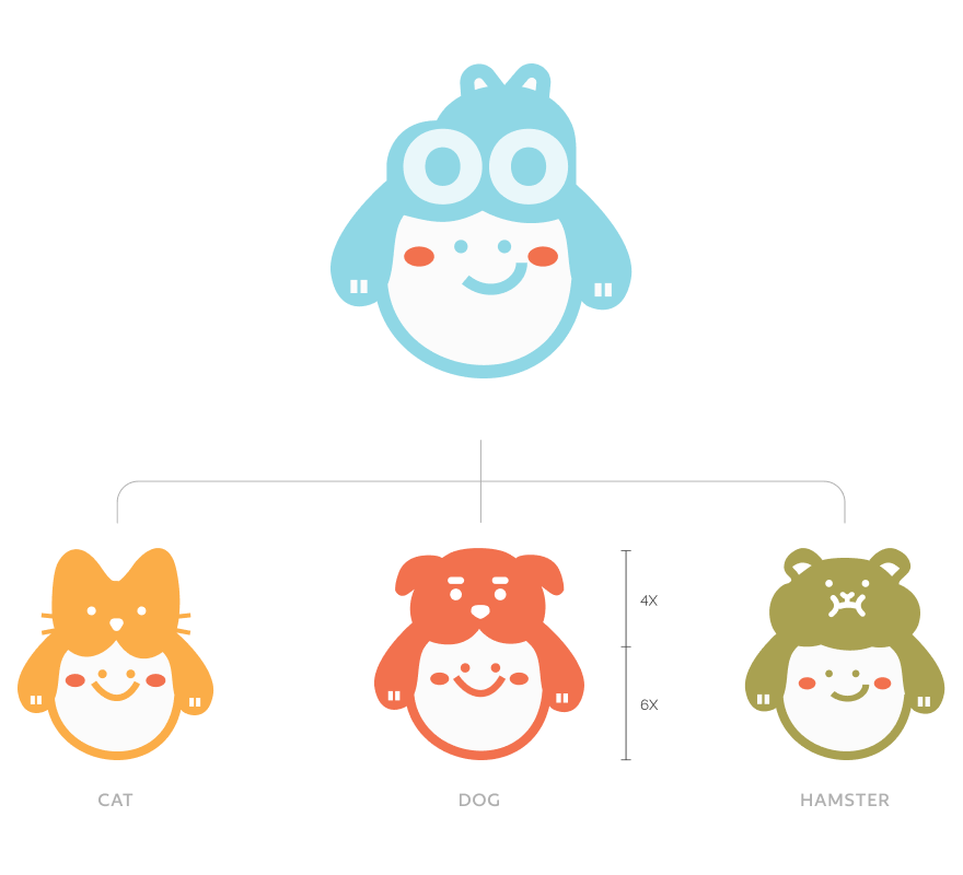
Character Mark Extension 吉祥物延伸系統
品牌吉祥物由原始 LOGOMARK 延伸而來,在保留核心結構的基礎上發展為不同動物形象。簡化的幾何特徵與圓潤輪廓確保各版本之間維持視覺一致性。
整體比例由動物造型與臉部區域構成,上方動物輪廓約佔整體高度的 40%,下方臉部圓形約佔 60%,以提升表情辨識度與親和感,同時保留物種特徵。不同角色對應貓、狗與倉鼠等陪伴形象,在比例與結構上保持統一,使品牌在延伸應用時兼具彈性與識別度。
The brand mascot is derived from the original logomark and adapted into different animal forms while retaining its core structure. Simplified geometric features and rounded contours maintain visual consistency.
The upper animal silhouette occupies approximately 40% of the total height, while the lower facial area accounts for 60%, enhancing clarity and approachability. Each variation represents companions such as cat, dog, and hamster, ensuring flexibility while preserving brand recognizability.
04 Color Schemes
Redo’s color palette is designed to evoke trust, reliability, and financial clarity, ensuring that every touchpoint reflects our commitment to accuracy and efficiency.
Together, these colors create a strong, dependable, and forward-thinking brand identity, ensuring that Redo is instantly recognized as the go-to solution for financial corrections and optimization.
Redo’s color palette is designed to evoke trust, reliability, and financial clarity, ensuring that every touchpoint reflects our commitment to accuracy and efficiency.
Together, these colors create a strong, dependable, and forward-thinking brand identity, ensuring that Redo is instantly recognized as the go-to solution for financial corrections and optimization.
Brand Colors
40%
#8FD7E5
RGB 143 215 229
CMYK 47 0 14 0
羈絆藍
Bonding
Blue
20%
#F2714E
RGB 242 113 78
CMYK 4 69 66 0
脈動橘
Pulse
Coral
20%
#FBAD48
RGB 251 173 72
CMYK 3 42 74 0
暖光黃
Sunlit
Amber
20%
#A9A151
RGB 169 161 81
CMYK 42 34 77 0
歸屬綠
Nest
Olive
Color Usage Ratio 色彩比例
建議色彩比例以主色為主要使用色(約 40%),輔助色作為重點點綴(各約 20%),以維持視覺平衡與品牌一致性。
It is recommended to apply the primary color as the dominant tone (approximately 40%), with secondary colors used as accents (approximately 20% each) to maintain visual balance and brand consistency.
Color Variations 延伸色系
#356670
Dark
#8FD7E5
羈絆藍
Bonding
Blue
#E9F7FA
Light
#AE462A
Dark
#F2714E
脈動橘
Pulse
Coral
#FFECE7
Light
#BE8233
Dark
#FBAD48
暖光黃
Sunlit
Amber
#BE8233
Light
#615D34
Dark
#A9A151
歸屬綠
Nest
Olive
#FBF8E1
Light
Monochrome Logo 單色標誌


Grayscale
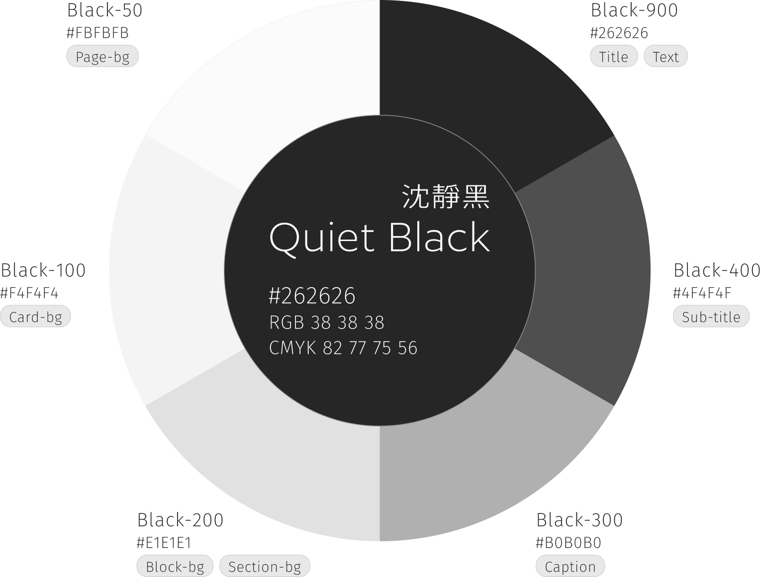
沉靜黑構成品牌視覺中的基礎灰階系統,提供穩定、沉著且不干擾主色的視覺環境,使整體畫面更具層次與秩序。
系統依明度區分為 Black-50 至 Black-900,可應用於背景、文字與輔助資訊等情境,建議依資訊層級選用對應色階,以維持閱讀清晰度與視覺一致性。
Quiet Black forms the foundational grayscale system of the brand, providing a stable and balanced visual environment that supports the primary colors while maintaining clarity and hierarchy.
The system ranges from Black-50 to Black-900 and can be applied across backgrounds, typography, and supporting information. Appropriate shade selection is recommended to ensure readability and visual consistency.
Logo Color Usage
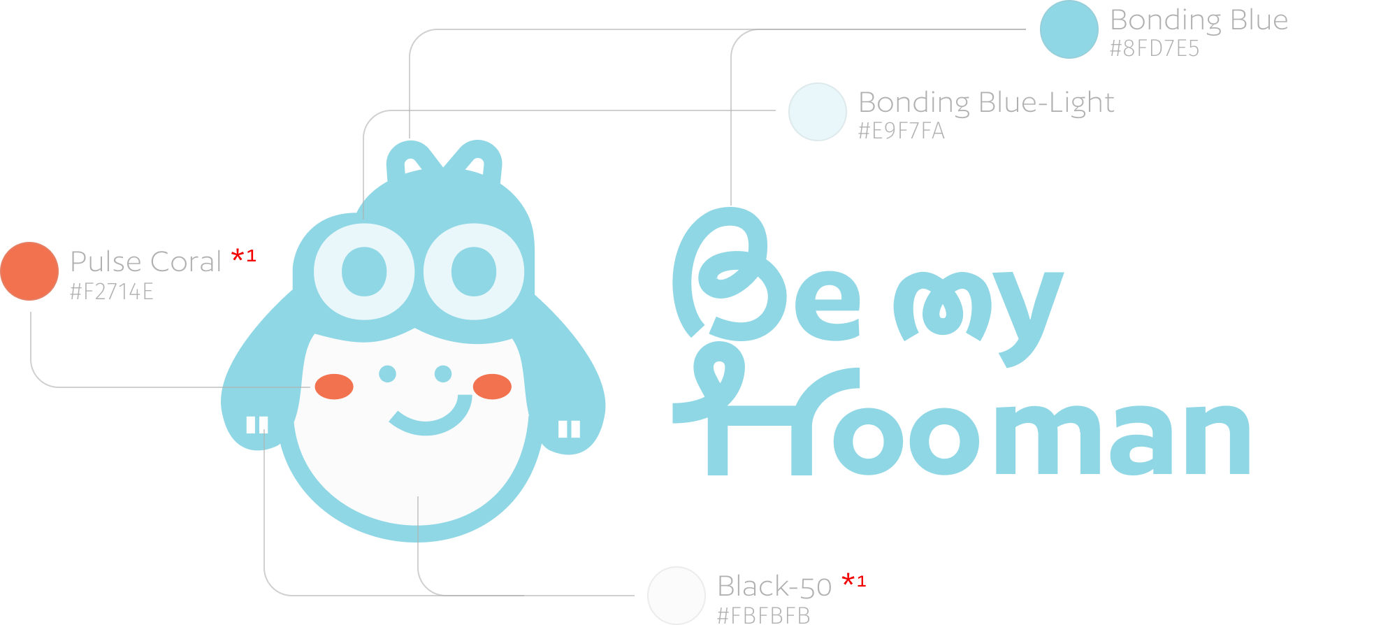
Logotype Color Specifications 標準字色彩規範
標準字顏色可依品牌色系進行應用,並需與圖形標誌主體色維持一致。於白色背景上建議優先使用主色「羈絆藍」,必要時可使用黑白版本。
The wordmark color may be applied using colors from the brand palette and must remain consistent with the primary color of the logomark. When used on a white background, the primary color version (Bonding Blue) is recommended; monochrome versions may be used when necessary.
*1
圖形標誌與品牌吉祥物之臉部及腮紅、爪子為固定識別元素,應依規範使用指定色彩呈現,不得任意調整、替換或套用其他顏色。
The facial features, blush, and paws of the logomark and mascot are fixed elements and must always appear in the specified colors. These elements must not be altered, replaced, or applied in any other colors.
Color Combination
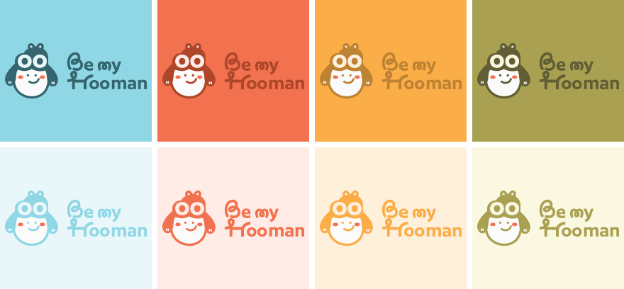
Primary Lockup / Secondary Lockup / LogoType
此為主標誌、次標誌與標準字之完整色彩應用示例。透過不同背景色的搭配,展示品牌於實際應用場景中的視覺表現。
使用時應依背景明度選擇適當的標誌版本,避免與背景色過於接近。完整標誌組合(含標準字)不宜使用過深之背景色,以確保文字清晰度與整體辨識性。所有組合皆須維持清晰對比與一致比例,不得任意調整顏色或排列方式。
Here presents Logotype and Logomark color application examples.The variations demonstrate how the brand identity performs across different background environments.
The appropriate logo version should be selected based on background brightness to maintain sufficient contrast. The full logo lockup (including the Logotype) should not be placed on excessively dark backgrounds to preserve text clarity and overall recognizability. All combinations must maintain clear hierarchy and consistent proportions, and color alterations are not permitted.


LogoMark / Character Mark
圖形標誌和吉祥物可依品牌色系進行不同色彩組合應用。在替換顏色時,需維持主體、臉部與背景之間清晰的色階差異與對比,以確保圖形辨識度與視覺一致性。
The logomark and mascot may be applied using color combinations from the brand palette. Adequate tonal contrast between the character, face, and background must be maintained for clear recognition.
05 Typography
Be my Hooman 的字體系統以「溫柔中的清晰感」為核心,透過理性結構與柔和曲線的搭配,建立親和且具有辨識度的品牌語言。
Be my Hooman’s typography system is built around the idea of “clarity with warmth,” combining structured forms with soft curves to create an approachable and recognizable brand language.
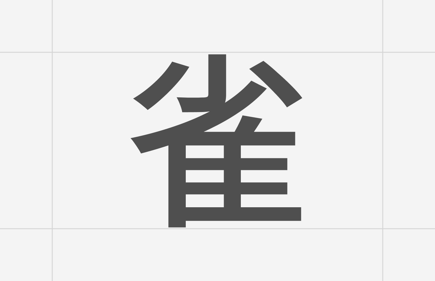
中文字體「未來螢黑體 Glow Sans-Extended」具有乾淨俐落的幾何結構與延展字面,在維持閱讀清晰度的同時,也透過細緻且穩定的筆畫傳達溫柔與安心感,適用於介面資訊、品牌內容與數位應用。
The Chinese typeface, Glow Sans-Extended, features clean geometric structures and extended proportions that ensure readability while conveying a sense of softness and stability through its refined strokes. It is well suited for interfaces, brand communication, and digital applications.
英文字體「Author」則以圓潤且富有節奏感的字形呈現,結合幾何感與手寫特徵,為品牌增添親和、溫暖與情感溫度。其柔和曲線也呼應品牌中陪伴、連結與歸屬的核心精神。
The English typeface, Author, presents rounded and rhythmic letterforms that blend geometric structure with handwritten characteristics, adding warmth, friendliness, and emotional personality to the brand. Its soft curves reflect the brand’s focus on companionship, connection, and belonging.
Chinese Typeface
未來熒黑體
English Typeface
Author
Sizing
滾滾長江東逝水
Lorem ipsum dolor sit amet.
Type Sizes > 72pt/px
110% Leading
-2% Tracking
滾滾長江東逝水
Lorem ipsum dolor sit amet.
Type Sizes 49–72pt/px
110% Leading
-2% Tracking
滾滾長江東逝水
Lorem ipsum dolor sit amet.
Type Sizes 25–48pt/px
120% Leading
-1% Tracking
滾滾長江東逝水
Lorem ipsum dolor sit amet.
Type Sizes 0–24pt/px
135% Leading
0% Tracking